Sign in With Base & Base Pay
Base account offers two buttons to use in your application:- Sign in with Base: for user authentication for your product
- Base Pay: payments for online and offline goods
Sign in with Base
Integrating “Sign in With Base” offers a convenient and trusted way for users to access your services. By leveraging their established Base account, users can avoid creating and remembering new credentials, leading to a smoother onboarding and login process.Best Practices
To provide the best possible user experience when integrating “Sign in With Base,” consider the following guidelines:- Offer Value for Sign-in: Clearly communicate the benefits of signing in. Users should understand why they are being asked to sign in, such as to personalize their experience, access premium features, or synchronize data across devices.
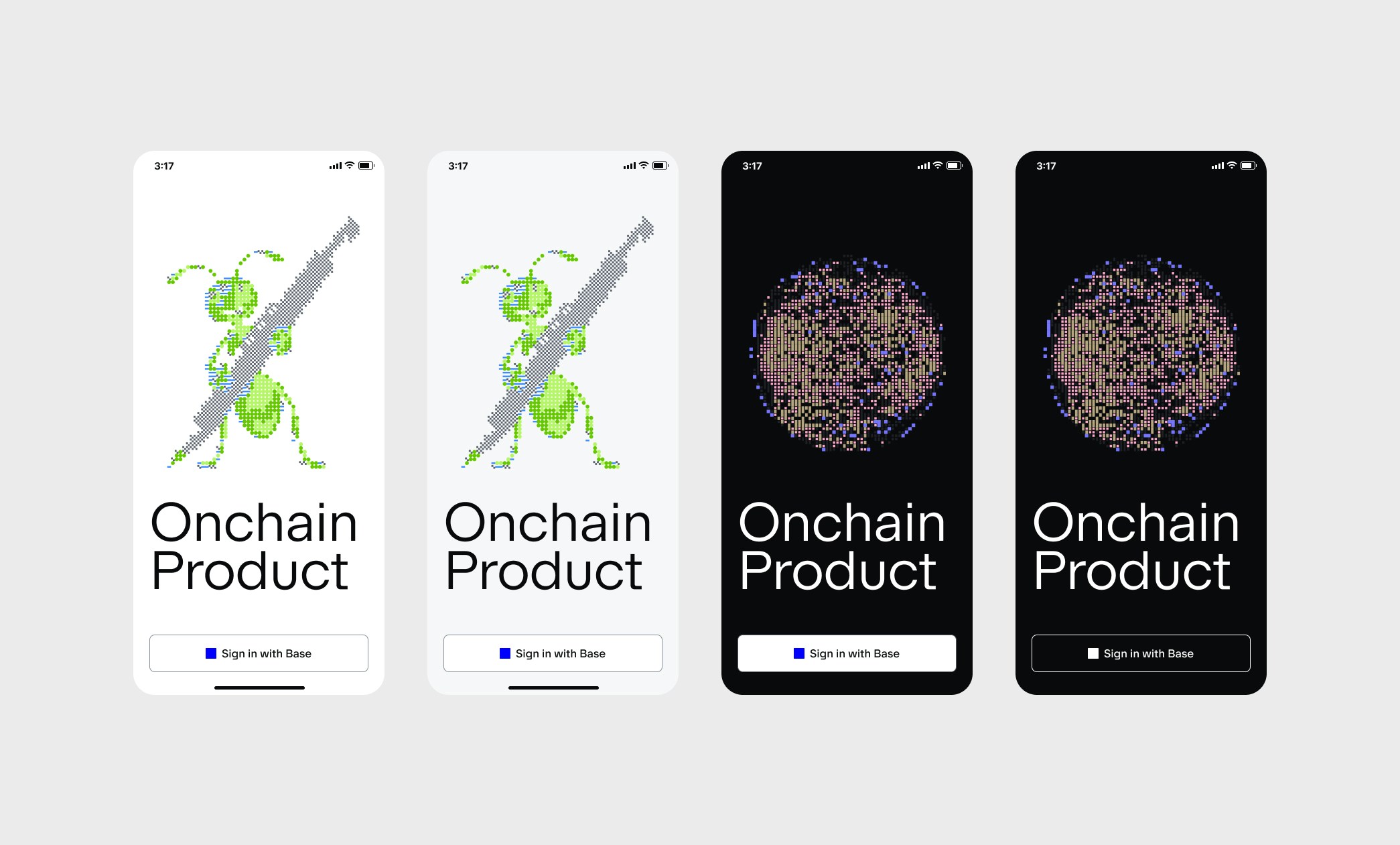
- Prominently Display the Button: Make the “Sign in With Base” button easily discoverable. It should be no smaller than other sign-in options and should not require users to scroll to find it.
- Consistent Placement: Place the “Sign in With Base” button in a consistent and logical location on your sign-in and account creation screens.
Design & Brand Guidelines
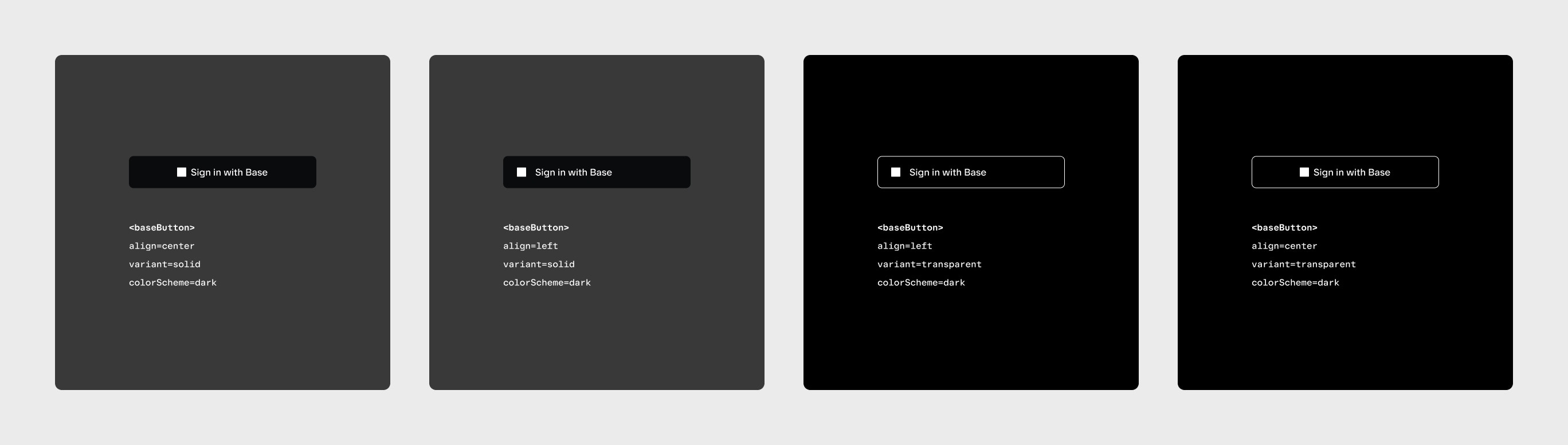
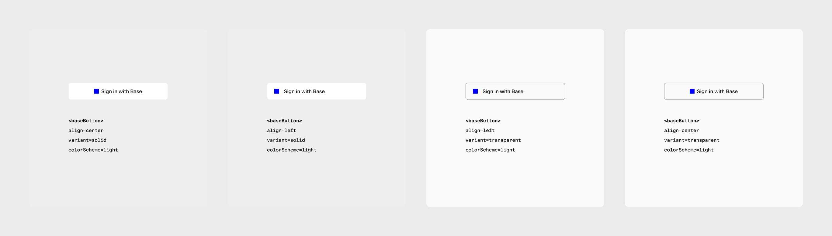
The “Sign in With Base” button should be easily recognizable and consistent across all platforms. Adhering to these design guidelines ensures a familiar and trusted experience for users.Button Appearance
The “Sign in With Base” button has two key components:-
The Base logo is a blue square
- The square never changes shades of blue, it’s always
#0000FF - In dark mode, the square changes color to pure white
#FFFFFF
- The square never changes shades of blue, it’s always
-
The “Sign in with Base” text
- Always use “Sign in with Base” unless there’s an explicit “Sign in” heading prior
- Use “Base Sans” where possible, otherwise create a custom button
DO
- Leave at least 8pt of padding in-between the base square and “Sign in with Base”, if creating a custom button
- Use base blue on a white/light background
- Use the all-white lockup if on a black/dark background
- Use “Sign in with Base” (including “Sign in”) unless “Sign in” is present as a heading on the screen
DON’T
- Use gradients for the logo
- Change the corner radius of the logo
- Change the color of the Base Square
- Use Base Blue on a dark background
(Click to enlarge)
(Click to enlarge)
Examples
(Click to enlarge)
Creating a custom button
You can customize the “Sign in with Base” button to match the style of your application. Below is an example of Privy using Base branding within their user interface style. Notice that:- The ratio and color of the Base Square is maintained
- A “Sign in” header is present, so just “Base” is used as the sign in option
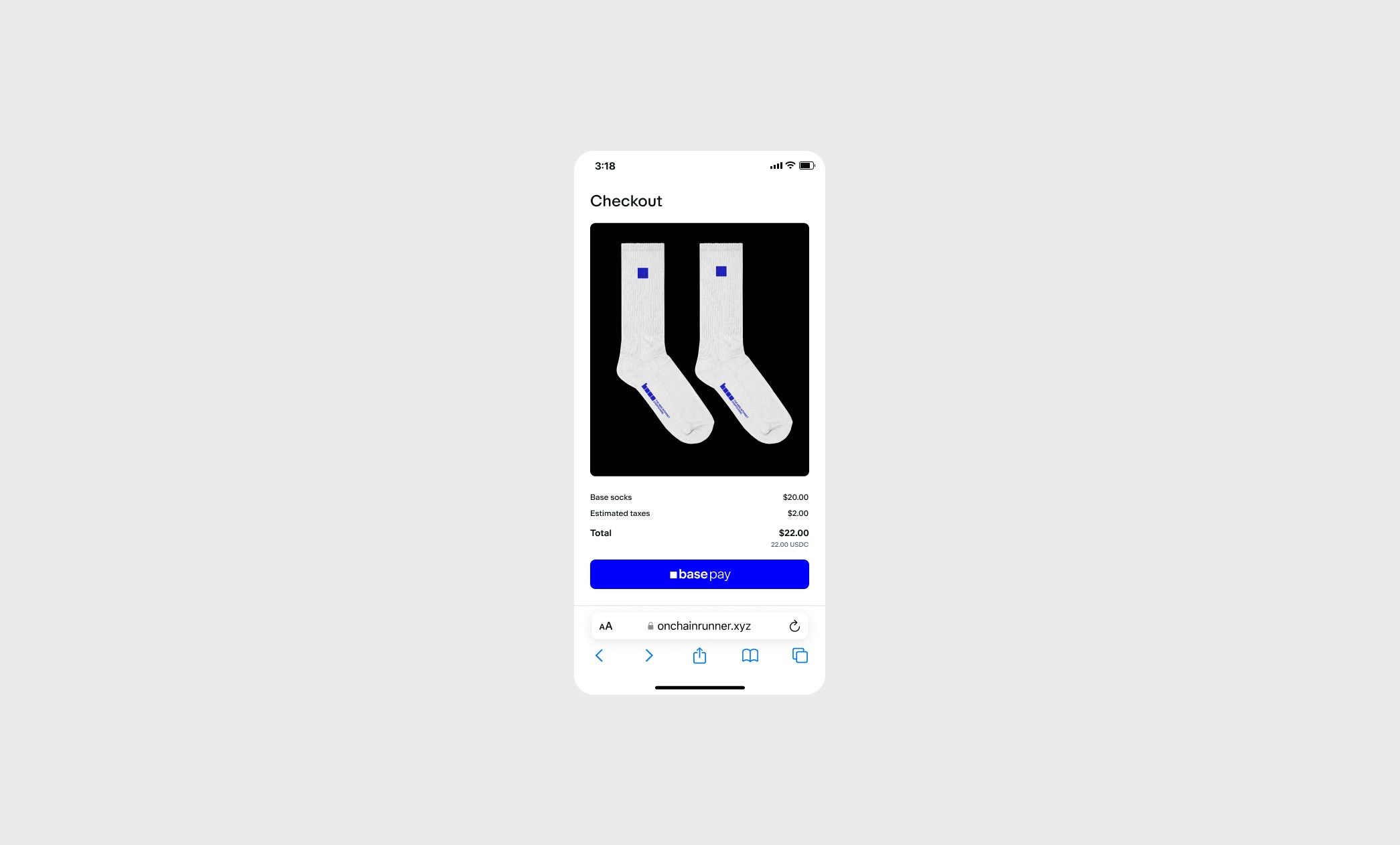
Base Pay
Integrating “Base Pay” offers one-click checkout for users with a Base Account. Integrate it into your product for easy purchase power for online and offline goods.Design & Brand Guidelines
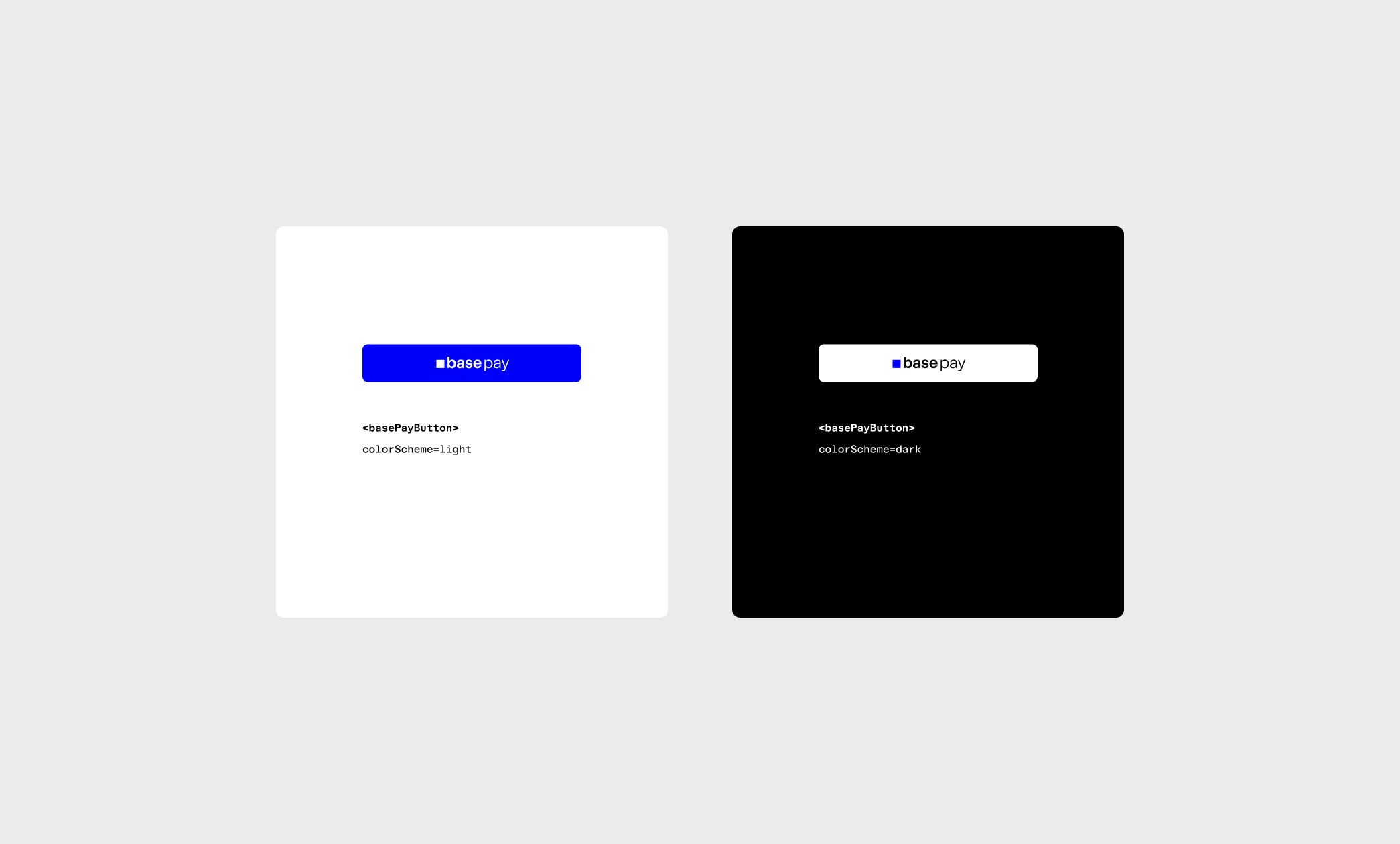
The “Base Pay” button should be easily recognizable and consistent across all platforms. Adhering to these design guidelines ensures a familiar and trusted experience for users.Button Appearance
The “Base Pay” button always uses a combination mark. It never uses typography or text to write “Base Pay” or “base pay”. Following are some DOs and DON’Ts for the Base branding:DO
- Always use the “Base Pay” combination mark
- Use the all white version of the combination mark on dark backgrounds
- Use at least 1X the height of the button for padding. If the mark is 24px high, pad the button with at least 24px on all sides
DON’T
- Write “Base Pay” or “base pay” using fonts or text
- Change the combination mark in any way
- Change the color of the Base Square
- Use Base Blue on a dark background
Examples
(Click to enlarge)
(Click to enlarge)