
Best Practices
- 44px minimum touch targets
- Thumb-friendly placement
- Clear visual hierarchy
- Clear navigation states to indicate to users where they are
- Performance optimized with smooth 60fps animations
- State persistence across page loads and sessions
Common Patterns for Mobile Navigation
Tab Navigation
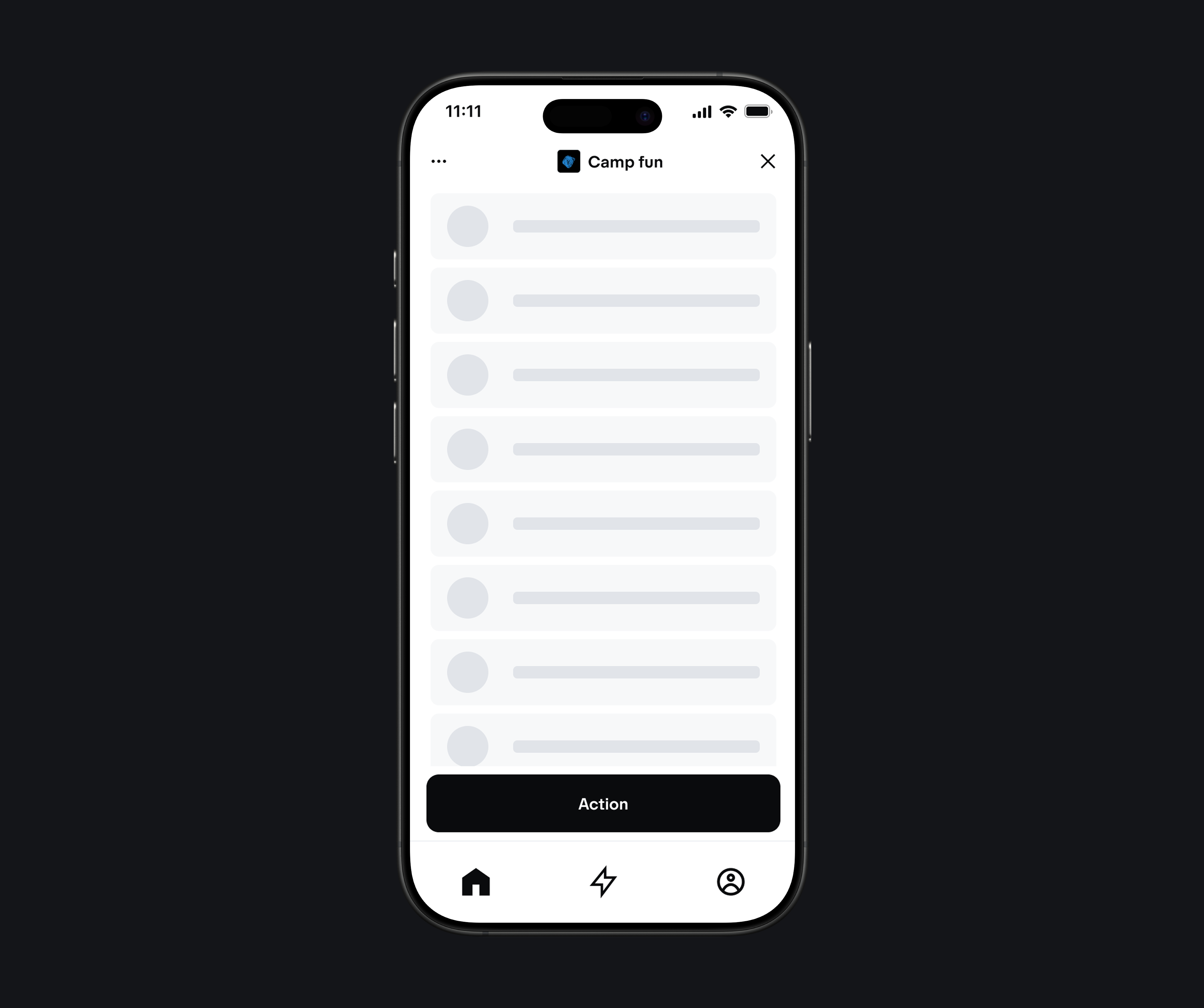
- 3-5 primary sections maximum for optimal usability
- Icon + label combination for clear identification
- Active state clearly indicates current section
- Badge indicators for notifications and counts
Sidebar
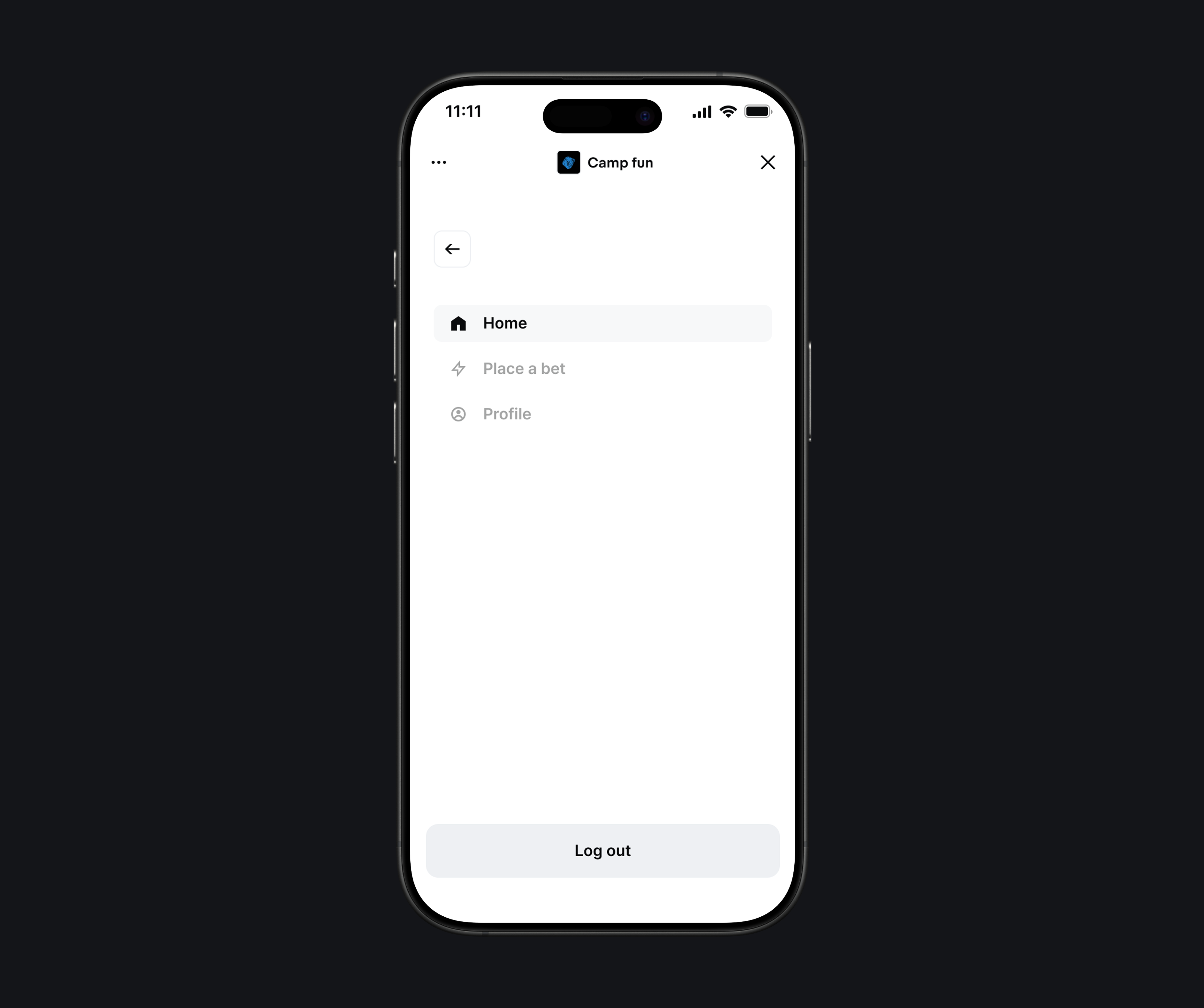
- Collapsible drawer that slides out from the side
- Clear hierarchy organizing items by importance
- Overlay design that doesn’t interfere with main content
- Quick access to search and user account features
Common Mistakes
Mobile-First Issues
- Desktop-first thinking - Starting with desktop navigation and scaling down
- Insufficient touch targets - Making buttons and links too small for mobile
- Poor thumb reach - Placing important actions outside comfortable thumb zones
- Ignoring gestures - Not leveraging native mobile interaction patterns
Web App Specific Issues
- URL synchronization - Not keeping navigation state in sync with browser URL
- Poor offline experience - Navigation that breaks when network is unavailable
- Inconsistent state - Navigation state not persisting across page loads
- Accessibility gaps - Missing keyboard navigation and screen reader support
Design Issues
- Too many options - Overwhelming navigation menus with too many choices
- Unclear labels - Vague or confusing navigation text
- Inconsistent patterns - Different navigation styles throughout the app
- Poor visual hierarchy - Not clearly showing importance and relationships
Testing
Device Testing
- Real device testing - Test on actual mobile devices, not just browser dev tools
- Different screen sizes - Test across various mobile screen sizes and orientations
- Touch interaction - Verify all touch targets work properly
- Performance - Check navigation performance on slower devices and networks
User Experience Testing
- One-handed usage - Test navigation with single-hand operation
- Thumb reach - Verify all important actions are within comfortable reach
- Gesture testing - Ensure swipe and other gestures work as expected
- Accessibility testing - Test with screen readers and keyboard navigation
Usability Testing
- Task completion - Observe users completing common navigation tasks
- Error rates - Track mis-taps and navigation errors
- Time to complete - Measure how quickly users can navigate to key features
- User feedback - Gather qualitative feedback on navigation clarity and ease of use
Tools and Resources
- Chrome DevTools - Mobile device simulation and performance testing
- Lighthouse - PWA and mobile performance auditing
- axe DevTools - Accessibility testing for mobile
- BrowserStack - Cross-device testing platform
- Figma Mobile - Mobile-specific design templates and components