
Basics
Primary Colors: Your primary color should represent your brand.- Call-to-action buttons
- Active states
- Key interactive elements
- Brand recognition
- Secondary actions
- Background accents
- Supporting UI elements
- Visual variety
- Text colors: High contrast for readability
- Background colors: Subtle variations for depth
- Border colors: Subtle separation between elements
Themes
Light and Dark Modes
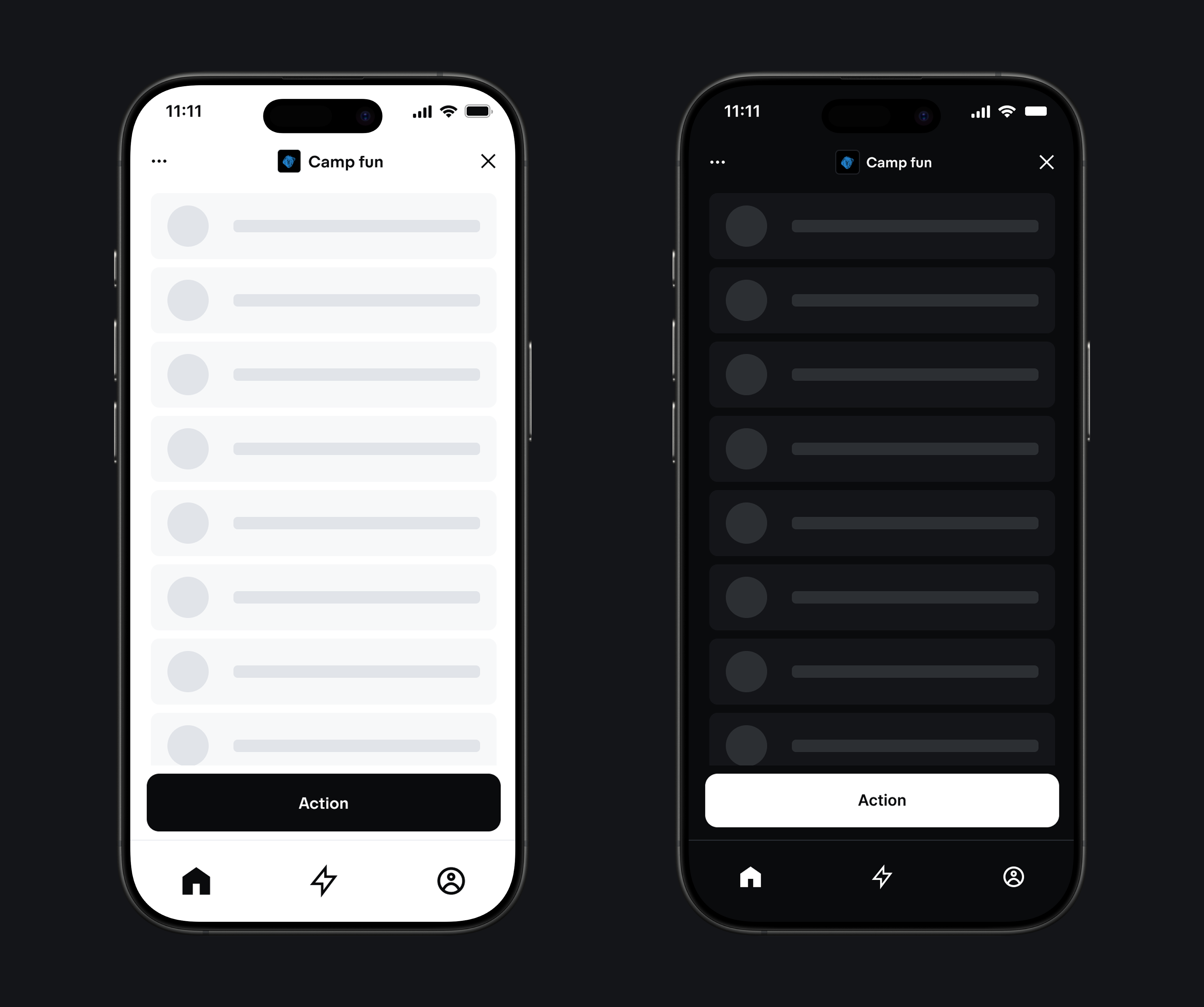
- Light mode: Clean, bright interface for daytime use
- Dark mode: Reduced eye strain for low-light environments
- System preference: Respect user’s OS theme setting
- Manual toggle: Allow users to override system preference
Theme Considerations
- Consistent contrast: Maintain proper contrast ratios in both themes
- Color meaning: Ensure semantic colors work in both contexts
- Brand consistency: Keep brand colors recognizable across themes
- Smooth transitions: Add transitions for theme changes
- User preference: Respect system preferences by default
Best Practices
- Start with a limited color palette
- Define clear usage guidelines
- Document your color system
- Test thoroughly before implementation
Implementation Examples
Standard CSS Approach
Define semantic color names with comprehensive theming support using CSS custom properties:Tailwind CSS with Custom Theme
Testing Your Color System
- Test all color combinations
- Verify contrast ratios using tools like WebAIM
- Check in different lighting conditions
- Test on various devices and screens
- Validate cultural appropriateness