- Base app account
- Vercel account for hosting the application
Deploy Template
Click the button below and follow the prompts to deploy the quickstart template to Vercel.
Deploy to Vercel
Rapidly deploy the quickstart template to Vercel to get started.
Clone your repository
Clone the repo created by Vercel to make local edits.Replace
<your-username> with your github username.Terminal
Update Manifest configuration
The
minikit.config.ts file is responsible for configuring your manifest located at app/.well-known/farcaster.json and creating embed metadata.For details on each field, see the field reference.minikit.config.ts
Create accountAssociation Credentials
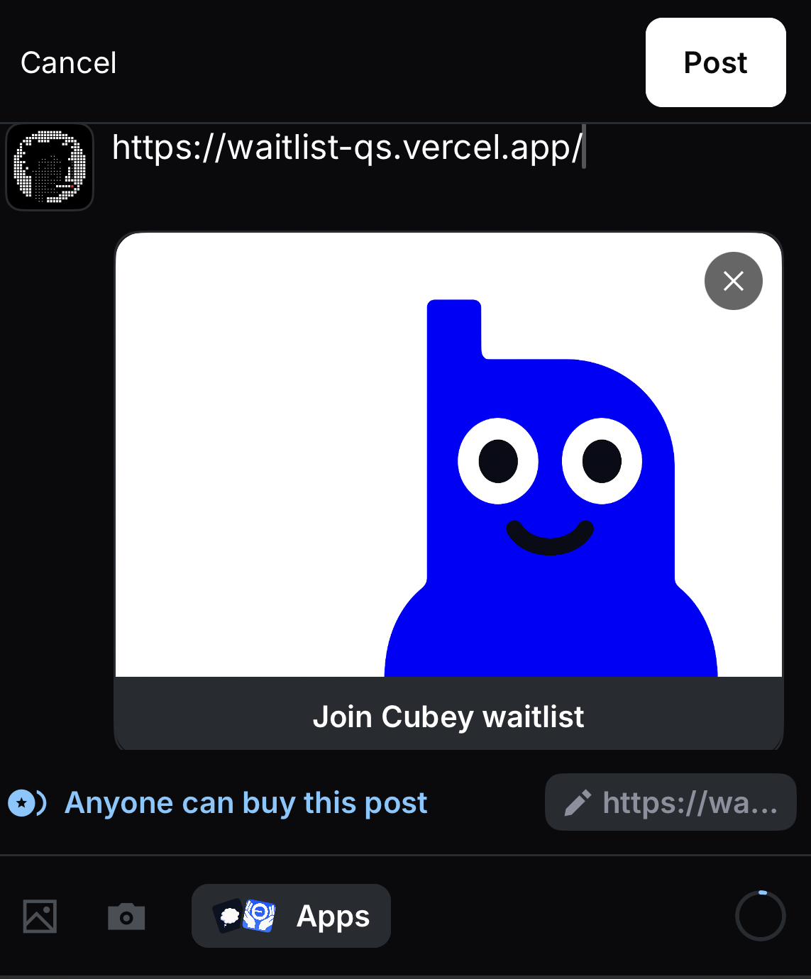
Now that you have a public domain for your application, you are ready to associate your mini app with your Farcaster account.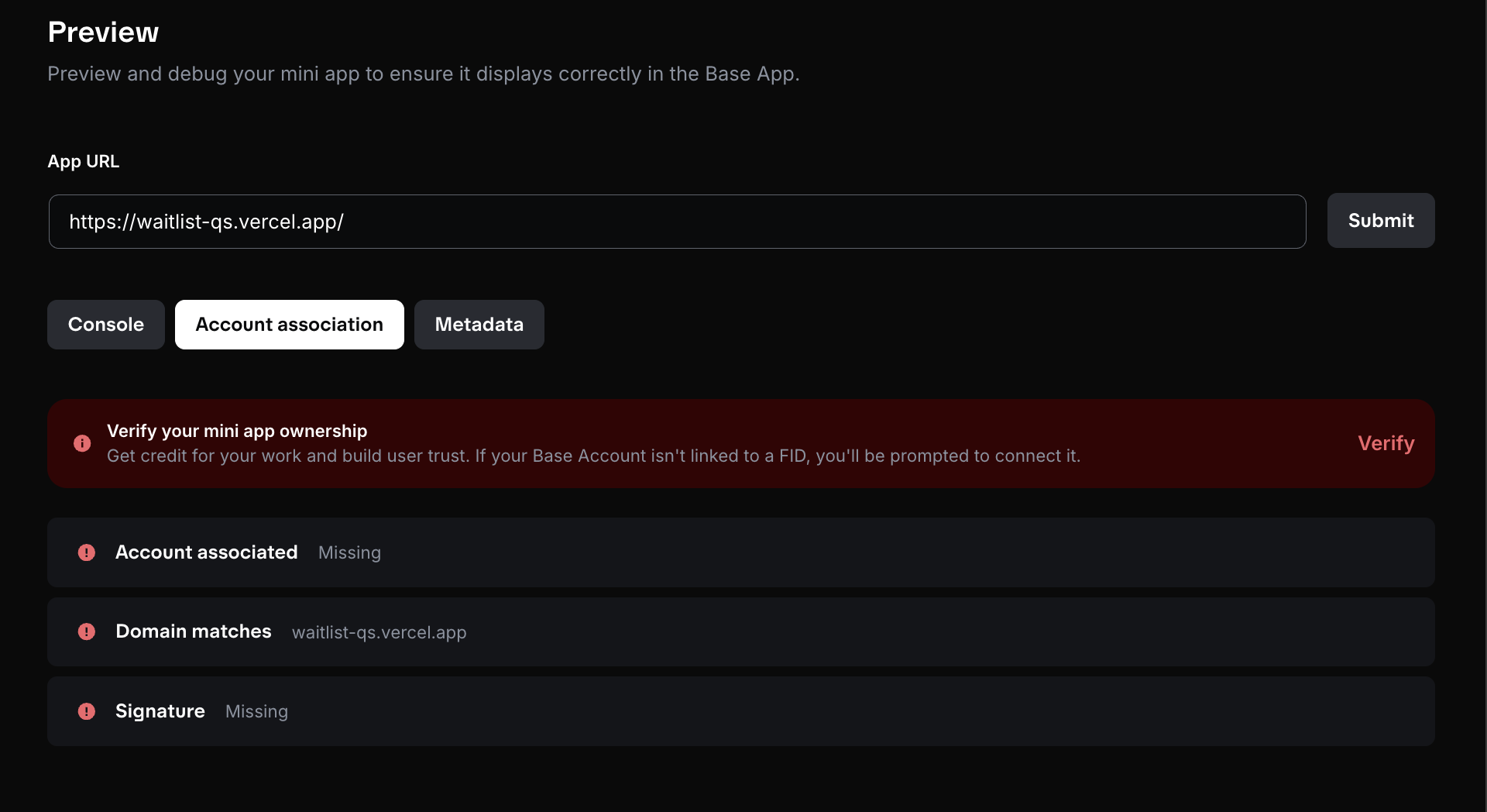
-
Ensure all changes are live by pushing changes to the
mainbranch. - Navigate to the Base Build Account association tool.
-
Paste your domain in the
App URLfield (ex: sample-url.vercel.app) and click “Submit”
- Click on the “Verify” button that appears and follow the instructions to generate the
accountAssociationfields. - Copy the
accountAssociationobject
Update `minikit.config.ts`
Update your
minikit.config.ts file to include the accountAssociation object you copied in the previous step.minikit.config.ts
Push updates to production
Push all changes to the
main branch. Vercel will automatically deploy the changes to your production environment.Preview Your App
Go to base.dev/preview to validate your app.
- Add your app URL to view the embeds and click the launch button to verify the app launches as expected.
- Use the “Account association” tab to verify the association credentials were created correctly.
- Use the “Metadata” tab to see the metadata added from the manifest and identify any missing fields.