Overview
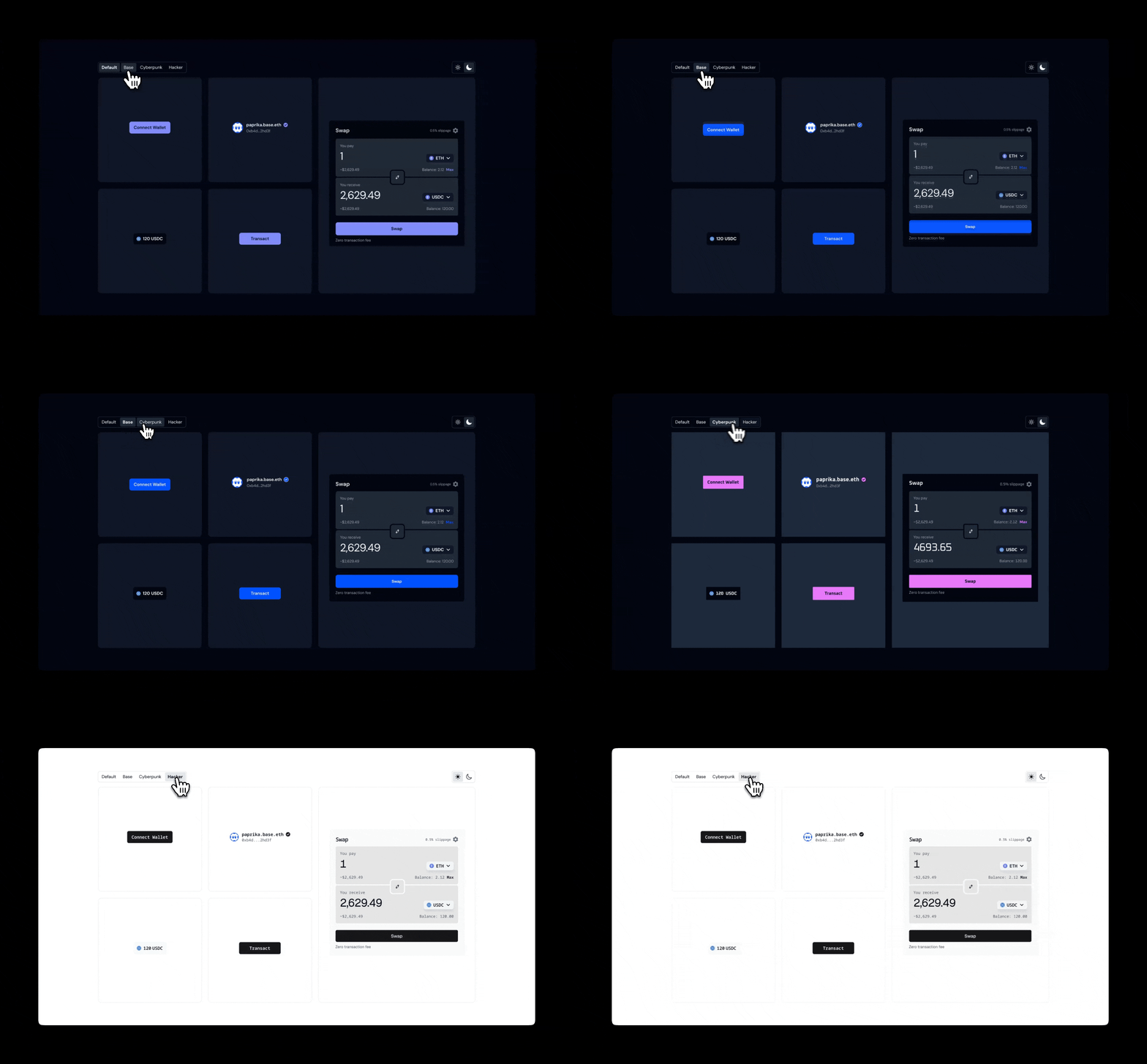
OnchainKit provides flexible appearance control through two main features:mode and theme.
- Mode: Controls the light/dark appearance and includes an auto option that inherits the system preference.
- Theme: Governs the overall styling across components.
Built-in Themes
OnchainKit offers multiple themes to quickly style your components. Set the theme via theOnchainKitProvider using config.appearance.theme:
default: Includes both light and dark modes.base: Single mode only.cyberpunk: Single mode only.hacker: Single mode only.custom: Single mode only.
default theme is applied automatically.
Mode
Control the color scheme by setting theconfig.appearance.mode property of the OnchainKitProvider:
auto: Automatically switches between light and dark mode based on the user’s OS preference.light: Forces all components to use the light version of the theme.dark: Forces all components to use the dark version of the theme.
auto mode will be applied by default.
CSS Overrides
Fine-tune specific aspects of an existing theme. This is useful when you want to make adjustments to the appearance of the components without creating an entirely new theme.Custom Theme
Define an entirely new look and feel for your application. This gives you complete control over all aspects of the design, including colors, fonts, and other visual properties.Usage Options:
Automatic Light/Dark Mode Switching:
- To automatically switch between light and dark versions of your custom theme:
Single Theme Version:
- To use only one version of your custom theme at all times:
Defining a custom theme
Use CSS variables to define your custom theme. The class name definitions must include the-light or -dark suffix.